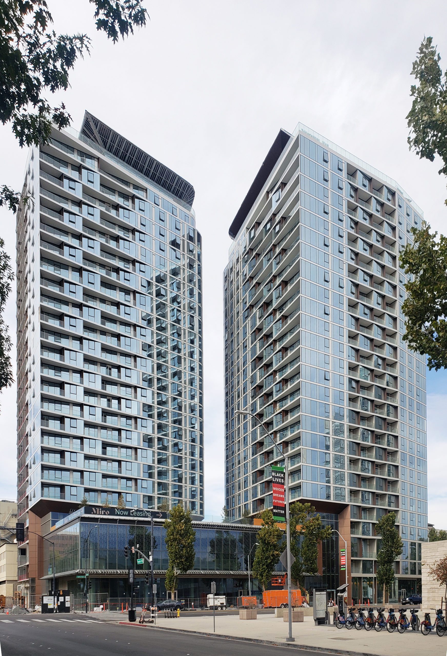
There are many things to admire about the Miro Towers apartments, San Jose’s newest and tallest high-rise building project that occupies the north side of East Santa Clara Street between Fourth and Fifth streets.
A whimsical moniker
We begin with the tongue in cheek project name that pays fond, absurdist tribute to Barcelona-born Catalan surrealist artist Joan Miro. One connection between the building and its honoree is the developers like art and music, and decided to support them tangibly, in part by providing curated gallery space and sound-dampened music practice rooms.
Tallest in town
At 28 stories and a 298-foot height, Miro has been San Jose’s most visually convincing high-rise since it was topped out in 2020—nearby airport flight patterns inhibit true skyscrapers.
Miro is the tallest building in Silicon Valley, and the tallest between San Francisco and Los Angeles. But there’s a catch—these superlatives are time-sensitive, with a two-foot taller project rising at the other end of downtown, so those bragging rights will soon turn into a pumpkin. Fortunately, the towers will survive well past midnight.
Any useful evaluation of Miro should be weighted heavily on its architectural and urbanistic features rather than on height alone.

Unobstructed views
As the region’s highest built vantage point, Miro is poised to deliver spectacular views. It doesn’t disappoint in that respect, with 360-degree perimeter rooftop decks, beefy cantilevers, obstruction-free glass parapets, windows and balconies all bring great light and lightness to Miro.
Views are also exceptional from within the apartments thanks to more than 300 glass-fronted balconies and floor-to-ceiling window walls. One apartment stack has an unduplicated close-up view of the City Hall tower.
These visual devices create an uncanny sense of floating and serenity, especially when seen from the higher floors. Some other downtown high-rises produce similar perceptions, but to a lesser degree.
Urban design, density and location
Miro’s development team took full advantage of the urban design cachet provided by big city vistas, as well as city-strengthening tools inherent in the project location and its intensified human presence.
It’s across the street from City Hall, and fronts on East Santa Clara Street, the spine of the region’s bus transportation network. Its edge-of-downtown location and permissive zoning combined to produce a plan that accommodated 444 apartments per acre—630 units on a 1.42-acre site. In terms of human occupancy, the towers could house about 650 tenants per acre when full. If these numbers seem high, that’s because they are.
Additionally, San Jose State University, a magnet for 40,000 students, faculty and staff, is a block away. It’s also not far from the long-awaited arrivals of high-speed rail and the BART extension. Not bad for a town that’s often derided as one big suburb.
These raw numbers are impressive per se; it will be interesting to see how downtown adapts to Miro Towers and similar speculative real estate ventures, and vice versa. It will also be interesting to see whether the current and projected densification of central San Jose will make smart development practices more likely to occur, or instead contribute to further vehicular congestion.

One big move, and many small ones
Steinberg Hart’s first big design decision was simple: split its allowable building envelope of a million square feet in half, creating two slim glass towers. Typical downtown practice has been to make even the tallest buildings wider than their height, thereby producing the city’s famous crew-cut skyline.
The second decision was complex: use the 324 glazed tower balconies as primary design elements whose size and shape vary widely, but still follow what Steinberg Hart design architect Edmund Rivera calls “a systematic approach.” These do not project outward like conventional balconies, but are recessed in a pattern of structured complexity, with slightly shifted grids for the balconies and window walls.
Similarly, the exterior form and orientation of the tower floor plans, which appear identical and squared off, actually feature deliberate geometrical irregularities. These subtly unconventional design elements deserve an article of their own, for they are the architectural heart of Miro Towers, giving them their spirit and identity.
John Pastier is a trained architect who was the Los Angeles Times’ first architecture critic. He has been writing about buildings and cities since 1965, and has taught at UCLA, UC Berkeley, UT Austin and McGill. He published the first monograph on architect Cesar Pelli in 1980.


Leave a Reply
You must be logged in to post a comment.